Showing posts with label eyeshadow. Show all posts

Wednesday, 4 July 2012

MAC Eyeshadows I've Hit Pan On

Predictable Ronseal title there. Without further ado:

Top row: Dazzlelight, Vex, Blanc Type, Phloof!
Bottom row: Coquette, Patina, Copperplate
The first two pans on the top left are nearly new, since I totally finished up my first Dazzlelight and Vex.

Top row: Dazzlelight, Vex, Blanc Type, Phloof!
Bottom row: Coquette, Patina, Copperplate
L-R: Dazzlelight, Vex, Blanc Type, Phloof!
These four are my favourite highlight/lid colours. Dazzlelight is my staple neutral for all over the lid - really brightening without being overly frosty. Vex is a gorgeous unique shade, a silver/beige with green/pink duochrome. Blanc Type looks incredibly dull swatched, but is an almost perfect match for my skintone (tiny bit yellow) and very useful for blending out edges, or evening out the lid. Phloof! is a verrrry frosty pink-white, best suited for an inner corner highlight, but I have been known to wear it over the lid with matte purples in the crease. I do love a bit of shimmer, me.

L-R: Coquette, Patina, Copperplate
Coquette is my eyebrow colour, an excellent cool-toned mid-brown shade which is also useful for defining the crease. Really glad I found this, as it doesn't get many mentions on blogs. Patina is the one I'm surprised I've hit pan on, since I don't use it very often - this is about as warm a brown as I can comfortably wear. My rubbish swatch doesn't show the antiqued gold shimmer on this, which is very pretty. Finally, Copperplate is a brilliant buttery matte grey-brown, super pigmented and blendable, which can be worn as a light wash or a dark smoky crease. This is a touch too dark for my brows in the daytime, but I do use it in the evenings for a more dramatic look, as it's nice and cool.

These are definitely among the MAC shadows I would repurchase (or already have done), and use on a regular basis. My next foray into my MAC palettes will be following up the purple theme!

Till next time,

Josephine x

Thursday, 8 March 2012

U-taupe-ia?

Yeah, I went there. (I'm pretty sure I'm not the first and I won't be the last - just felt compelled to do it!)

Taupe is a pretty magical colour. As far as I'm concerned, a taupe is somewhere along the spectrum between grey and brown. (A great blogger who is particularly passionate about taupe is Elvira of The Pink Sith, who has an awe-inspiring collection!) I gravitate towards the greyer taupes, since I'm so cool-toned (as I may have mentioned an obnoxious number of times in my previous post, apologies!), but since lots of "true" greys turn blue/silver on the skin when blended, or are too dark and harsh for daytime, taupes are some of my staple daily shadows. This may be deviating from the "taupe" brief somewhat, but I also class purple-toned greys in the same general category of "wearable every neutral-ish colours", so I've included them here.

This post was prompted by my acquisition of the Maybelline Color Tattoo 24 Hour Eyeshadow in Tough As Taupe, from Stacey's blogsale. Having heard lots about these on various blogs, I was v. excited to be able to try them in the flesh, so to speak. (I also picked up Audacious Asphalt and Bold Gold, of which more another time.) I don't know if these are going to launch in the UK at all, but they're basically a version of cream potted shadows, in the same vein as MAC Paint Pots/Benefit Creaseless Cream Eyeshadows. Here's hoping they do make an appearance on these shores, as my impressions are pretty good so far!

Here are all the taupes I pulled from my collection:

Top row, L-R: NARS Lhasa, Ruby & Millie Beige 840P, Chanel Illusoire.

Middle row, L-R: Maybelline Tough as Taupe, Benefit Skinny Jeans, Illamasqua Hollow.

Bottom row, L-R: MAC Morning Frost, MAC Copperplate, MAC Satin Taupe.


Here are swatches of what I think of as the purple-toned taupes:

Top to bottom: NARS Lhasa, Ruby & Millie Beige 840P, Chanel Illusoire, MAC Satin Taupe
I've raved about NARS Lhasa before, so I won't add much here, except to say this is the perfect colour for a daytime slightly smoky eye. It doesn't photograph brilliantly (not helped by the fact I'm not a brilliant photographer), but in person it's more purple, with a subtle shimmer/sheen. Gorgeous.

I think Ruby & Millie Beige 840P (I absolutely hate brands with numbered shades!) might be discontinued - I don't think Boots stocks the range any more, at least. But if you can get hold of this, I highly recommend it! Amazing buttery formula, incredibly pigmented (much more so than Lhasa). Basically a cooler version of Satin Taupe, as you can see from the swatches.

Chanel Illusion D'Ombre in Illusoire. These did the blog rounds last year sometime, and I just had to get this colour (especially with money off on the Debenhams website). A shimmery (almost glittery, really) purple-grey? Yes please. I don't plan on picking up any other shades, but this bizarre sponge/gel hybrid formula is brilliant - buildable, blendable, long-lasting.

MAC Satin Taupe must be one of their most famous eyeshadows. It's a good frost, pretty pigmented and shimmery rather than glittery. This is a plummy cool brown - looks great in the crease with Phloof! or Vex on the lid. I'm definitely glad I bought into the hype on this one!

And the rest:

Top to bottom: Maybelline Tough as Taupe, Benefit Skinny Jeans, Illamasqua Hollow, MAC Morning Frost, MAC Copperplate.
Tough as Taupe is a grey-brown elephant-coloured taupe, quite dark - basically a cream version of Copperplate, one of my favourite MAC shadows. It's very pigmented, and applies well, but I did find it creased after about four hours' wear, so next time I'd wear this with a primer underneath. Very pleased with this!

Benefit Skinny Jeans Creaseless Cream Shadow is a bit different, more like a grey-green. I rarely wear this, but now I've swatched it, it's going in my everyday makeup bag! The formula is a bit drier and harder than the Maybelline shadow or the MAC Paint Pots, but it's very pigmented, applies smoothly and blends out well.

A multi-purpose product always appeals to me, so Illamasqua Hollow Cream Pigment, a cool-toned brown, is a bit of a winner - I use it on the eyes for a neutral matte wash, or on the cheeks for a subtle contour. Quite a dry stiff formula, but long-lasting and easy to apply with fingers.

I'm being a bit cheeky here by including two colours that aren't in the stores - MAC Morning Frost came out in a winter collection last year (hence the white lid). This is the perfect easy everyday neutral to slap on with your fingers for those early morning starts: a shimmery cool brown, light enough to use all over the lid, and you can get away without a primer.

MAC Copperplate is a staple for me. A cross between grey and brown, it's a matte squared (why are there not more of these?), so applies smoothly and is incredibly pigmented and blendable. It's a touch too dark for my brows in daytime, so I use MAC Coquette, but this is a really versatile shade for a light wash over the lid, or deepening the crease. To be honest, this is about as brown a shadow as I can comfortably wear!

So there you have it, my range of taupes! These are definitely some of my favourite shadows - where some people love warm browns, I love these!

Till next time,

Josephine x

PS. I finished my coursework, hurrah! It was a close-run thing, but I did it. Phew. Sadly the next deadline is 8th April, but I'm not thinking about that just yet...Hope you're all enjoying the sunshine today!

Monday, 5 March 2012

Rate or Slate #1: MAC Eyeshadow Edition

Having lighted upon an appropriate rhyming pair of words, I give you my version of the up/down, hot/not, in/out feature.

RATE: MAC VEX

Out with the old, in with the new - MAC Vex
This might just be my all-time favourite MAC eyeshadow - and I own thirty-one in total. It's certainly the first  eyeshadow I ever finished.

Questionable swatch photo ahoy!
This is one of the good frosts - applies smoothly, without chunky glitter, just shimmer. MAC describes this as "beige with pink-green pearl" - I agree about the duochrome pearl effect, but I see more silver/grey than beige. (Maybe a very cool-toned beige.) 

This is the perfect all-over lid colour for me, either to wear on its own or with a grey/purple (such as MAC Blackberry or Satin Taupe, or NARS Lhasa) in the crease. I 100% recommend that you give this a swatch next time you're at a MAC counter/store, if you're in the market for a wearable yet unique everyday lid/highlight colour. I am very pinky-pale, with blue/grey eyes, so I definitely favour cool-toned eyeshadows, and this is the best neutral I've found so far!

Which brings me neatly (kind of) on to...

SLATE: MAC ALL THAT GLITTERS & WOODWINKED

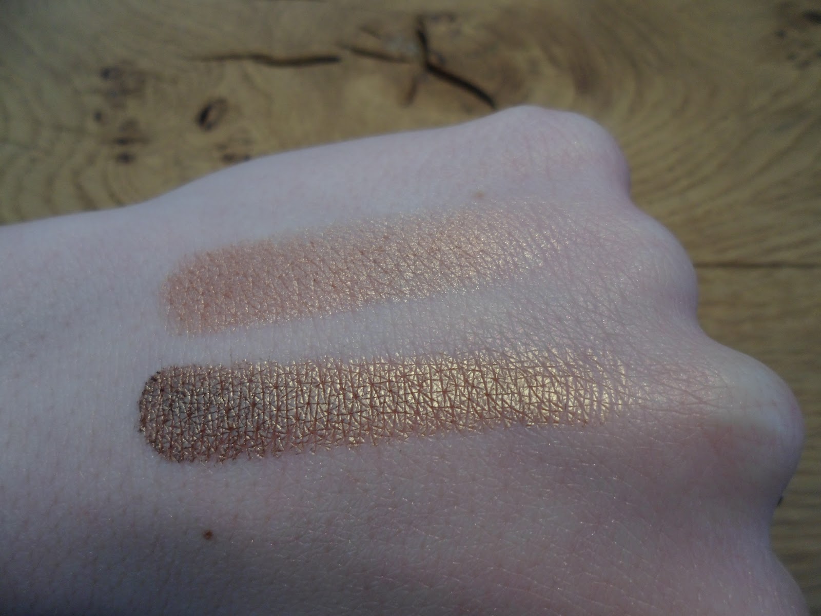
L-R: All That Glitters, Woodwinked
These are truly awful on me. As in, they're orange. Now, I know orange-toned eyeshadows are supposed to flatter blue eyes, but who cares if your eyes look bluer if you look distinctly ill/exhausted, with red eyes and grey skin? Bluer eyes be damned!

Top: All That Glitters; bottom: Woodwinked
These are both veluxe pearls, so they're super pigmented and smooth. And, in their own right, they're gorgeous colours, which look great on lots of people - just not generally people with my colouring, I imagine.

Top: All That Glitters; bottom: Woodwinked
These blended-out swatches really show the orange tones, particularly in Woodwinked. The change is actually quite dramatic, from the warm gold of the first swatch, to the fairly strident orange below.

Anyway, All That Glitters is a warm peach which is verrry popular - but on me it's not only too warm, it's too dark to use as a lid colour really. I have tried to wear this a few times in the past, especially since it's such a nice formula, but without much success. I will probably give this another whirl in summer, with peachy blush and some (gasp) bronzer, but it's not my favourite look by a long shot, and I'd always reach for something else in preference to be honest.

Woodwinked can look OK, if not particularly flattering, for a dramatic summer evening eye, if I use a primer (usually Too Faced Shadow Insurance), lots of black liner and mascara, and try not to blend it out too much so it doesn't turn lurid orange. But frankly there's never really a time when I can be bothered to use a product which works against my skin-tone so radically.

I would never repurchase either of these - not that I'll ever use them up. God knows why the sales girls encouraged me to buy these, rather than more suitable cooler-toned colours. These were among the first MAC shadows I ever bought, mainly on the strength of the enormous amount of blogger hype - so many girls listed these two among their favourite colours, that I just had to have them! Sad but true.

As always, these are just my personal opinions based on my experience with the shades mentioned. All That Glitters and Woodwinked suit a lot of people, but they absolutely don't work on my super-pale, cool-toned skin, which is such a shame!

Hopefully this will become a regular feature, since it encourages me to pick two or three products rather than ramble on endlessly about 20 in one post!

Till next time,

Josephine x

PS. It's so very wrong, but I am intermittently tempted by colours like Bronze and Antiqued, even though I know they'd look awful on me in the manner of Woodwinked. Curse you, MAC!

Saturday, 11 February 2012

My NARS Collection

I hesitated to use the word "collection" in the title, since I only have seven products from NARS (I know, "only"), and I'm determined not to let this spiral to a ludicrous number (see: my issue with MAC lipsticks and eyeshadows). I have my eye on a few more shades of blush - namely Mata Hari, Douceur, and Deep Throat - and perhaps the Sheer Glow foundation (in Siberia, naturally), but that's about it.

So here are the products I've accumulated thus far:


Two blushers, a single eyeshadow, a lipstick, and three Pure Matte lipsticks. And what shades did I plump for, I hear you cry?

Desire (L) and Sin (R) blushes; Lhasa single eyeshadow

Sin has already featured in my "everyday face" post, and it's still the resident blush in my daily makeup bag. It's a gorgeous shimmery plum colour, with a smooth buttery formula, which looks surprisingly natural on my pale pink skintone - especially lovely for cold weather.

Desire is a straight-up matte pink, leaning on the cool side. It has good colour pay-off, though it's not as smooth as Sin when swatched (probably due to the matte formula). I can't say I've used this anywhere near as much as Sin so far; I do love a good dolly-pink cheek, which this delivers when applied with a light hand, but I'm not in love yet. I shall persevere! I also managed to resist buying the new Gaiety blush from the Spring collection, after swatching it and finding it was just a cooler, less pigmented version of Desire. Sad face. Fingers crossed NARS isn't heading down the MAC "selling you the same colour three times over" road...

But that's not to say the Spring collection didn't have its redeeming features. Far from it, since it features my new favourite eyeshadow, Lhasa. I knew as soon as I saw the promo pictures online that I HAD to have this. Lavender grey? YES. (This is a situation for capitals, shouty and obnoxious though they are, trust me.) I haven't been seriously tempted by any eyeshadows from the brand before, as all the neutrals looked a bit warm for my taste/face. But this is a stunning heathery/misty grey (which clearly brings out the lame poet in me), just perfect for a subtle smoky daytime eye. It is also destined to be partnered with MAC Vex, which is possibly my all-time favourite MAC shadow. Success.

[Edit: Sabrina at The Beauty Look Book has a lovely post with swatches of Lhasa and other NARS shadows, including the new 413 BLKR eyeshadow which looks suspiciously similar. Why, NARS, why??]

And look, I did swatches! Crappy crappy swatches, but still. Taken in daylight, no flash.

Top to bottom: Lhasa, Sin, Desire

 Sin isn't looking particularly inspiring here, particularly because the shimmer doesn't translate well onto my freakish giant hand (and it isn't this brown in person, more cool plum), but it's definitely worth a look next time you're at a NARS counter.

And now for the lipsticks:

L-R: Schiap, Carthage, Valparaiso, Vesuvio

And on my luminously white arm (these are literally one swipe each, that's how pigmented they are):

Top to bottom: Vesuvio, Valparaiso, Carthage, Schiap

Schiap was my first ever NARS purchase, which I bought in Selfridges after an assessment day last summer. Hot, sticky, and knackered, I made a beeline to Oxford Street as soon as the last hideous business analysis exercise was over, and bought the brightest damn lipstick I could find. Hot pink lip products are my weakness (okay, one of my weaknesses!). This is a fabulous example of my particular favourite, the matte blue-pink lipstick.

Carthage is a recent acquisition from Charlie's blogsale. I'd been eyeing it up for a while, but couldn't justify it full price given its similarity to Schiap - then when I came across it in a blogsale I couldn't resist! It's a slightly warmer, lighter pink than Schiap, perfect for summer. And of course it's in the truly excellent Pure Matte formula, which swipes on in seconds, is completely matte, and wears for an age - what more could you need?

Valparaiso also comes from the Spring collection, though why they thought this gorgeous, dramatic purple-berry shade was appropriate for spring I do not know. But I love it for the wintry weather we're having at the moment. The sales guy tried to entice me to buy a matching lipgloss, blasphemy! I would never sully its matte perfection with a tacky gloss.

And finally, Vesuvio - because much as I love pink lipsticks, you can't go wrong with a classic neutral bright red. You can see I'm not a big fan of subtle lip colours, let alone the dreaded nude lip - which looks great on some people, but makes me look absolutely terrible. (That's not to say I didn't purchase a few paler lipsticks, like the raved-about Hue and Creme Cup, during the first flush of my MAC addiction, but they now sit completely unloved in my makeup drawers, oops!)

So, if you enjoy bold matte lip colours, I highly recommend the Pure Matte line - and there are some pretty-looking more natural shades as well, if that's more your bag. However, I've got to say my recent lipstick acquisitions have somewhat cast these into the shade (shocking, I know!). Yes, I am the proud owner of three(!) Rockalily lipsticks, which I've been wearing nonstop since I got them. Definitely a blog post in the making!

Till next time,

Josephine x

Sunday, 15 January 2012

My MAC Neutral Palette

Disclaimer: this is a pretty epic post, apologies!

So I thought I’d post about my MAC neutral eyeshadow palette – because I’m endlessly nosy about what shades other people pick for theirs. Also, when I first started out buying MAC, owning a full palette was the ultimate dream (I now own two, because I’m greedy). And finally, I’m so pale and very cool-toned, so warm colours generally look awful on me – hence my palette has none of the warm browns that look so lovely on other people. I do own the (in)famous Woodwinked and All That Glitters, but I look distinctly ill if I wear them, so they’re relegated to my less-used colours palette, awaiting the day I really want to look like I’ve cried myself to sleep (you never know). I'll pop up a separate post on that palette another time - hopefully admiring all the pretty colours will encourage me actually to use them!

Without further ado, the palette in all its dusty glory:


Left to right, top to bottom:
Crystal Avalanche, Blanc Type, Nylon, Dazzlelight, Phloof!
Vex, Omega, Era, Patina, Satin Taupe
Blackberry, Coquette, Copperplate, Print, Typographic

Given my sadly lacking photography skills, I think swatches might be a bridge too far; there are so many good versions out there (for starters, Temptalia and Karla Sugar, who do a far, far better job that I ever could). So I’ll stick to some descriptions and opinions of each colour.

Crystal Avalanche: This is my latest purchase, which found its way into my basket while buying two Iris Apfel lipsticks. It’s a white shimmer (veluxe pearl I think – I’m not great on the finishes, as they’re not printed on the pans). Not overly impressed so far, since it’s not quite as pigmented as I thought it would be, but it does the job for inner corner highlighting. I’ve only used it once or twice though.

Blanc Type: this is a pale cream, with a matte squared finish. When I first got it I didn’t think I’d use it, as it hardly shows up on my skin tone (just a tad darker/yellower), but it’s great for blending out darker shades, and on its own for a minimal wash of colour over the lid to even things out. Lovely.

Nylon: It was this or Ricepaper, and I’m glad I got this! It’s a white-gold shimmer, without being overly yellow or harsh. Gorgeous highlight.

Dazzlelight: I’ve already bought a replacement pan. Need I say more? Veluxe pearl finish, so it applies like a dream. I love using this as an all-over wash on the lid, or as a highlight. Neutral cream shimmer, with a subtle pink cast (this and the next shadow are as pink as I can sensibly go on the eyes without looking ill). Would repurchase over and over.

Phloof!: Basically a pink-toned version of Nylon. I use this as a highlight with purple or other cool-toned colours, or as an eye-brightening lid colour when I’m feeling lazy. Very shimmery, so if that’s not your thing, maybe go for a shade with a more satin finish.

Vex: Another favourite, as you can tell. Backup already purchased. A unique colour I think. A cross between grey and champagne shimmer, with pink/green sheen. Great all over the lid with a grey or purple in the crease (also just generally great – definitely check this shade out if you’re pale and cool-toned).

Omega: Not 100% sold on this one. I haven’t used it an awful lot, but it’s been in my palette for a few months. It’s a fairly cool mid-brown matte shade, OK in brows, OK in the crease. Not rave-worthy. I definitely didn’t need this one – more a result of the foolish yet overpowering urge to fill up the palette.

Era: I feel this has potential, but I’m yet to discover it in full. It’s basically a slighter lighter version of Omega with a subtle shimmer. I bought this with the intention of wearing it with winged liner and red lips, but I feel I probably already had other colours which do the job. And like Omega this is a smidge warm for me.

Patina: I’m not quite sure how I hit pan on this – a fairly early purchase in my MAC spree, I suppose. It’s lovely though – depending on how much you blend it out, it can be a bronzed brown, or an antiqued gold. I think it has a pink/green duochrome thing going on, but it’s subtle and depends on the light. Just about cool enough for me to wear all over the lid. Worth checking out.

Satin Taupe: Obviously had to own this, given its cult status – though I did um and ah about purchasing for a while. As I’m sure you know, it’s a plummy brown, or a browny plum, depending on how you look at it. Great colour pay-off, lovely on the outer lid with Vex or similar. Deservedly popular I think (though how “taupe” it is remains up for debate).

Blackberry: A muted plummy purple matte shade, great for in the crease. I like this with Vex and/or Phloof! (yes, sadly that shade does have an exclamation mark in its name – cheers MAC). I bought this in preference to all the matte browns MAC seems to do so many of, and it does the job. Can look like a generic crease colour, or more purple if blended out.

Coquette: I never hear this shade talked about on Youtube/blogs, but I love it! It’s a green-toned brown (which sounds, and is, quite weird), which I use every day in my brows – because I live in fear of having red-toned brows if I use a “truer”, warmer brown. Fairly decent pigmentation for a matte colour, but not scarily dark for brow-related purposes. Also good in the crease. Would definitely repurchase.

Copperplate: I love this eyeshadow. The perfect taupe (cool grey-brown – though I’m not completely sure that’s what taupe is). Amazing application and colour pay-off (matte squareds are awesome, why are there not more of them MAC?). I used to use this in my brows pre-Coquette, but I had to be careful to use a light hand.

Print: I bought this ages ago, along with Electra (in my colour palette), but I hardly ever use it. It’s a decent enough satiny mid-grey, but somehow I never reach for it – occasionally for smoky evening looks, which let’s be honest I rarely bother with. Pigmentation isn’t outstanding, but I suppose that’s not what this shade is for. I have definitely found MAC’s selection of greys and grey-toned colours very limited compared to the legions of browns, which is a shame. Though maybe I just need to play around with this one more to give it its due.

Typographic: I bought this in preference to Carbon, which I hadn’t heard great things about. It’s another matte squared, which means it’s impressive on the pigmentation/application side of things – basically a matte black, which is useful to have around but not a daily-use item. I mainly use this as a liner with an angled brush (when I can be bothered, i.e. rarely), or to darken the outer V for evening eyes. Worth having, but probably very dupeable with a cheaper brand.

I now have black eyeshadow all over my hands and keyboard, having been swatching each shadow messily on my fingers while typing (not worth recording in the medium of photography to be honest), so I will stop there. Writing this has definitely inspired me to mix up my eyeshadow choices a bit more, and there are a few relative non-starters in the palette which I wouldn’t pick again given the choice, but overall I’m pretty happy with the neutrals at my disposal! Also, a full palette is definitely a satisfying thing to own (if you don’t let yourself think about the expense!), and I use mine every day.

Next up (at some point): the colour palette, and lots of eyeshadow-related buyer’s remorse!

Till next time,

LL x